
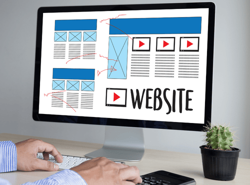
Website layouts shape how people understand and interact with content. Every designer eventually faces a key decision: follow a structured grid system or experiment with freeform placement. Both approaches can create attractive websites, yet each brings different strengths and risks. For aspiring web designers, understanding the difference between grid and freeform layouts is essential before choosing a direction.
What a Grid Layout Really Means
A grid layout is a structured framework built from columns and rows. Content sits inside defined boxes that align vertically and horizontally. The grid acts like an invisible skeleton guiding where text, images, and buttons should live. Most modern websites, from news portals to online stores, rely on some form of grid.
The purpose of a grid is not to restrict creativity but to create order. When elements align, users find information faster. Navigation feels predictable and professional. Designers can repeat patterns across multiple pages, which speeds up development and keeps branding consistent.
Understanding Freeform Layouts
Freeform layouts ignore strict alignment rules. Designers place elements wherever they feel most expressive. Text may overlap images, headings may sit at unusual angles, and spacing can change from section to section. This style often appears in portfolio sites, art projects, and experimental brands.
Freeform design aims to surprise the visitor. Instead of following a predictable path, users explore the page as they would a poster or magazine spread. When executed well, the result feels unique and memorable.
Why Grids Became the Industry Standard
Grids dominate professional web design for practical reasons. They adapt easily to responsive design, which is vital for mobile devices. When screen sizes change, grid columns can stack or resize without breaking the layout.
Grids also support teamwork. Multiple designers and developers can work on the same project because the rules are clear. A new team member immediately understands where to place components. This reliability explains why most business websites choose grid systems.
According to the Australian Bureau of Statistics, 97% of Australian businesses use the internet as part of their operations, making websites a critical channel for communication, marketing, and customer interaction. Structured grid layouts help these organisations present information clearly, maintain consistency, and deliver a professional experience across all devices.
The Creative Appeal of Freeform
Freeform layouts attract designers who want to break away from corporate uniformity. They allow storytelling through visual flow rather than rigid boxes. Brands focused on fashion, music, or personal identity often prefer this approach.
Freeform can express emotion in ways grids struggle to match. Irregular spacing and overlapping elements create energy and movement. For a designer building a personal portfolio, this freedom can communicate personality more strongly than a conventional structure.
User Experience Considerations
User experience should guide every layout decision. Grids usually win in clarity. Visitors know where to look for menus, headings, and calls to action. This familiarity reduces frustration, especially for older audiences or complex websites.
Freeform layouts demand more effort from users. If navigation becomes confusing, people leave quickly. Aspiring designers must balance artistic ambition with real human behaviour. A beautiful layout loses value if visitors cannot complete basic tasks.
Accessibility and Readability
Accessibility standards favour grid design. Screen readers, keyboard navigation, and assistive technologies work best when content follows logical order. Consistent spacing improves readability for users with visual impairments.
Freeform layouts can create accessibility challenges. Overlapping text or unpredictable focus order may block some users from understanding the page. Designers must test carefully to ensure creativity does not exclude part of the audience.
Development and Maintenance
From a development perspective, grids are easier to build. Frameworks like Bootstrap and CSS Grid are designed around structured columns. Updates and new pages follow the same pattern, reducing cost and time.
Freeform layouts often require custom code and detailed adjustments for each screen size. Maintenance becomes harder as the site grows. What looks exciting in a single mock-up may turn into a technical burden months later.
Brand Identity and Layout Choice
The right layout depends on brand personality. A law firm, medical clinic, or government service benefits from grid stability. These organisations need trust and clarity more than visual experimentation.
Creative studios and personal brands can use freeform to stand out. The layout itself becomes part of the message. Aspiring designers should study the client before choosing a style rather than following trends blindly.
Mixing Grid and Freeform
The debate is not always either or. Many successful websites combine both approaches. A strong grid can organise main content while individual sections break the rules for emphasis. This hybrid method offers creativity without losing usability.
For example, a homepage might use a clean grid for services and testimonials but switch to a freeform hero banner. Learning to blend the two systems is a valuable skill for new designers.
Tools That Support Grid Design
Modern design tools encourage grid thinking. Software such as Figma, Adobe XD, and web builders include column guides by default. CSS Grid and Flexbox allow precise control in the browser. These tools make structured design accessible even for beginners.
Templates and themes also rely on grids, giving aspiring designers a solid starting point. Understanding how to customise these systems is often the first step into professional work.
Challenges of Freeform Implementation
Freeform design requires strong visual judgment. Without clear rules, beginners can create clutter instead of creativity. Spacing, contrast, and hierarchy must be managed manually.
Responsive behaviour adds another challenge. What looks balanced on a large monitor may collapse on a phone. Designers need patience and testing to translate freeform ideas into functional websites.
Learning Through Practice
The best way to understand layouts is by building real projects. Aspiring designers should recreate existing websites using grids to see how structure guides content. After mastering basics, experimenting with freeform concepts becomes more effective.
Studying how users react is equally important. Feedback from friends or test audiences quickly reveals whether a layout communicates or confuses.
Choosing the Right Path
There is no universal winner in the grid versus freeform debate. Each project demands its own solution. Designers must consider audience, content volume, accessibility, and long-term maintenance before deciding.
Strong designers know when to follow structure and when to challenge it. The goal is not to prove artistic bravery but to serve the purpose of the website.
Website layouts influence how every visitor experiences a brand. Grids provide order, efficiency, and reliability, while freeform layouts offer expression and originality. Aspiring web designers who understand both approaches gain the flexibility to handle any project.
Learning to evaluate user needs, technical limits, and brand identity leads to smarter layout choices. If you are starting your design journey and need guidance on building practical, professional layouts that convert visitors into customers, Philippines Websites can help you turn creative ideas into real, user-friendly websites.
Frequently Asked Questions
1. What is a grid layout in web design?
A grid layout is a structured design framework that organises content into rows and columns. It helps designers align elements consistently, making websites easier to read, navigate, and maintain across different pages and screen sizes.
2. What is a freeform website layout?
A freeform layout allows designers to place elements more creatively without strict alignment rules. Text, images, and sections may overlap or appear in unconventional positions to create a more artistic and expressive visual style.
3. Why do most professional websites use grid layouts?
Most professional websites use grid layouts because they provide clear structure, improve readability, support responsive design, and make development easier. Grids also help teams maintain consistency across large websites.
4. When should designers use freeform layouts?
Freeform layouts work best for creative websites such as portfolios, fashion brands, or artistic projects where visual expression is part of the brand identity. However, they require careful design to avoid confusing users.
5. Can grid and freeform layouts be combined in web design?
Yes. Many modern websites combine both approaches. Designers often use a grid system for core content while introducing freeform elements in specific sections, such as hero banners or promotional areas, to add visual interest.