
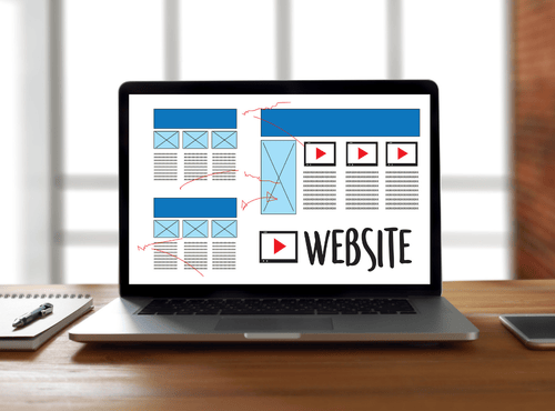
A beautiful website means little if visitors do not take action. Digital marketers judge success by leads, sales, and sign-ups rather than artistic awards. The structure of a page plays a major role in guiding people toward those goals. Certain website layouts consistently convert better because they match the way users read and make decisions. Understanding these layouts helps marketers design pages that turn attention into revenue.
1. The Focused Landing Page Layout
The focused landing page removes distractions and drives visitors toward a single objective. Navigation menus are limited, content is short, and the call to action stands at the centre of the design. This layout works well for advertising campaigns where every click has a cost.
Successful focused pages follow a clear sequence. A strong headline states the benefit, supporting text explains the offer, and a bold button invites the next step. Testimonials and trust badges appear near the form to reduce hesitation. By keeping choices minimal, this layout reduces confusion and lifts conversion rates.
2. The Problem to Solution Layout
This layout mirrors the conversation happening in a customer’s mind. The page begins by describing a common problem in relatable language. As the visitor recognises their own situation, the design introduces the product or service as the solution.
Sections alternate between pain points and benefits, building momentum toward the offer. Case studies and before-and-after examples strengthen credibility. Digital marketers favour this structure for services such as finance, health, and professional consulting where education is required before purchase.
3. The Story Brand Layout
People remember stories better than features. The story brand layout positions the customer as the hero and the business as the helpful guide. The page opens with a vision of success, acknowledges obstacles, and presents a plan to overcome them.
This narrative flow keeps readers engaged longer than traditional sales pages. Calls to action appear at natural turning points in the story. Brands that rely on emotional connection, such as travel or lifestyle products, often achieve strong results with this approach.
4. The Product Showcase Layout
Ecommerce marketers depend on the product showcase layout. High-quality images take the leading role while benefits, specifications, and reviews sit nearby. Grid sections display related items to increase average order value.
Clear add-to-cart buttons follow the user as they scroll. Delivery information, guarantees, and return policies appear close to the decision point. This layout reduces friction by answering questions before the shopper leaves the page.
5. The Lead Generation Layout
For businesses that sell complex services, collecting contact details is more valuable than instant sales. The lead generation layout centres around a form offering something useful such as a guide, quote, or consultation.
Content explains what the visitor will receive and why it matters. Bullet lists outline key outcomes, and social proof builds confidence. Marketers often pair this layout with email automation to nurture prospects after the initial conversion.
6. The Authority Content Layout
Long-form educational pages can convert surprisingly well when structured correctly. The authority layout begins with helpful information that demonstrates expertise. As trust grows, subtle calls to action invite readers to take the next step.
Sections use clear headings, images, and comparison tables to keep attention. This approach suits industries where buyers research heavily before committing, including software, medical services, and technical equipment.
7. The Comparison Layout
Many customers hesitate because they cannot decide between options. The comparison layout addresses this directly. Tables or side-by-side blocks highlight differences between plans, packages, or competitors.
Visual cues show the recommended choice. By simplifying evaluation, this layout shortens the decision process and increases confidence. Digital marketers often combine comparisons with limited-time incentives to encourage immediate action.
Elements Shared by High-Converting Layouts
Despite their differences, effective layouts share common principles. The first is visual hierarchy. Important messages appear larger and higher on the page so visitors understand the offer within seconds.
The second principle is clarity. Simple language and generous white space prevent overwhelm. Buttons use action-oriented words rather than vague labels. Images support the message instead of decorating randomly.
The third principle is proof. Reviews, testimonials, and statistics reassure sceptical users. Without proof, even the best layout struggles to convert.
Matching Layouts to Traffic Sources
Not all visitors behave the same way. People arriving from search engines often need information first, making authority or problem-solution layouts ideal. Paid advertising traffic usually responds better to focused landing pages with a single objective.
Email subscribers may convert through comparison or product showcase pages because they already know the brand. Smart marketers align layout choice with the intent of each audience segment.
Mobile Considerations
More than half of website visits occur on phones, so layouts must adapt to small screens. Buttons need generous spacing, and forms should request only essential fields. Long paragraphs that work on desktop can feel overwhelming on mobile.
The Australian Bureau of Statistics reports that 91% of connected Australian households use smartphones to access the internet, confirming that mobile devices play a central role in how users browse websites and interact with businesses online. This makes mobile-optimised layouts essential for improving usability, engagement, and conversion performance.
Testing layouts on real devices reveals issues that mock-ups hide. Conversion improvements often come from simple mobile adjustments rather than complete redesigns.
Measuring Layout Performance
Digital marketers should treat layouts as experiments. Tools such as heat maps, session recordings, and A/B testing show how users interact with each section. Moving a call to action a few centimetres or changing its colour can produce measurable gains.
Key metrics include conversion rate, scroll depth, time on page, and bounce rate. Decisions based on data outperform personal preference every time.
Common Layout Mistakes
Many websites fail because they mix too many goals on one page. Competing buttons and offers divide attention. Another mistake is placing important information below the fold where few visitors scroll.
Slow loading images also damage conversions. Even the strongest layout loses power if the page feels sluggish. Marketers should balance design ambition with performance.
Turning Layouts into Growth
Choosing a proven layout is only the beginning. Copywriting, images, and technical optimisation must support the structure. Regular testing and updates keep pages aligned with changing customer behaviour.
Digital marketers who understand layout psychology gain a practical advantage over competitors who rely on guesswork. The right structure guides visitors smoothly from curiosity to commitment.
High-converting layouts are not accidents. They reflect how real people read, compare, and decide online. By selecting a layout that matches audience intent and campaign goals, marketers can dramatically improve results without increasing traffic budgets.
Whether you need focused landing pages, lead generation designs, or ecommerce showcases, working with experienced professionals makes the process faster and more reliable. Philippines Websites can help you choose and build high-converting layouts that transform clicks into measurable business growth.
Frequently Asked Questions
1. What is a high-converting website layout?
A high-converting website layout is a page structure designed to guide visitors toward a specific action, such as making a purchase, submitting a form, or signing up for a service. These layouts use clear hierarchy, strong calls to action, and persuasive content to increase conversion rates.
2. Which website layout works best for landing pages?
Focused landing page layouts often perform best for marketing campaigns. They remove unnecessary navigation and distractions, highlight a clear benefit, and direct visitors toward one main action such as requesting a quote or signing up.
3. Why do digital marketers use problem-solution layouts?
Problem-solution layouts work well because they reflect how customers think. The page first describes a problem the visitor recognises, then presents the product or service as the solution, which builds relevance and trust.
4. How does mobile design affect website conversions?
Mobile design directly affects conversions because most users browse websites on smartphones. Layouts must be easy to read, buttons should be easy to tap, and forms should remain simple to complete on smaller screens.
5. How can marketers improve website layout performance?
Marketers can improve layout performance by testing different page structures, adjusting call-to-action placement, analysing user behaviour with tools such as heatmaps, and simplifying content to remove distractions.